We provide real time reporting and analytics with Wall Boards and Dash Boards. We develop custom reports tailored for your needs and also offer a number of standard reports as extension.
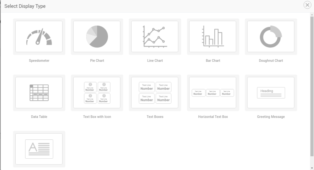
A Gadget is a graphical report added on a Dashboard. To add a new gadget on a dashboard,
Select a display type (doughnut, pie, line, bar charts etc) Select a data source or data serviceSelect which data attributes to be shown (as exposed by the data service) in the gadget and in what interval
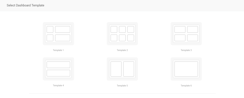
Dashboard Templates
Create call center wallboards or supervisor dashboards from quick, easy-to-follow templates.
Templates define a layout for a dashboard. Choose one layout and start adding desired gadgets into it.
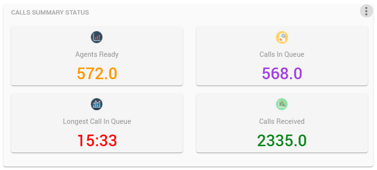
Real-time Queue Stats in Scorecards
Shows real-time information on a particular queue or on all queues in the form of scorecards. Statistics are available for agent or call stats, for instance, calls queued/handled/abandoned/offered, avg talk time/ wait time etc).
Drag and drop to adjust the gadget’s location on the canvas.
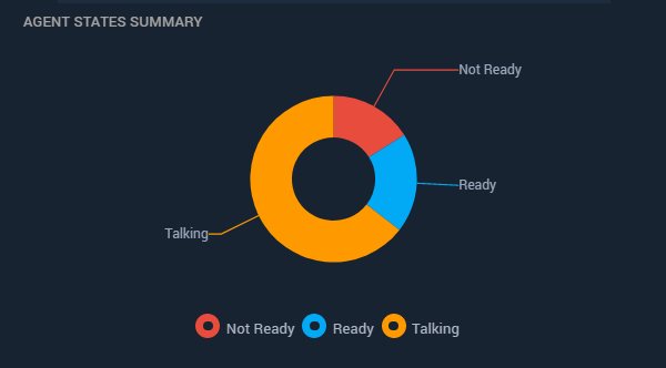
Real-time Agent Stats in Pie/Doughnut Charts
Displays agent statistics based on teams in the form of a Pie or Doughnut to show number of agents ready, not ready, talking out of all logged in.
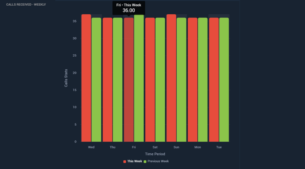
Historical Bar Charts
Show historical data of calls received, answered, abandoned in a queue or across all queues. Set the reporting interval to Daily or Weekly to filter the stats accordingly.
With comparison options, you can also optionally choose to compare stats of a day or hour to the previous day/hour for one key performance indicator.
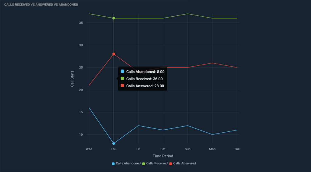
Historical Line Charts
Show historical data of calls received, answered, abandoned in a queue or across all queues in a line chart. Set the reporting interval to Daily or Weekly to filter the stats accordingly.
With comparison options, you can also optionally choose to compare stats of a day or hour to the previous day/hour for one key performance indicator.
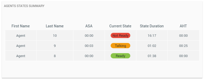
Team Summary as a Table
Team information in a tabular view showing agent name and picture, current Finesse state, time since in the current state and other agent stats such as the Average Handle Time, Average Speed of Answer.
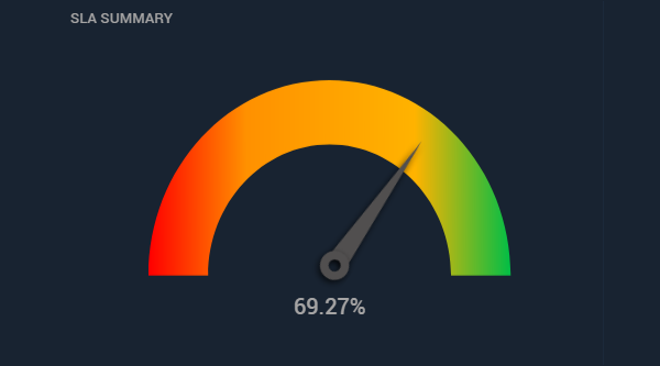
SLA stats in Speedometer
See the SLA of a queue or accumulated across all queues of a call center in the form of a speedometer.
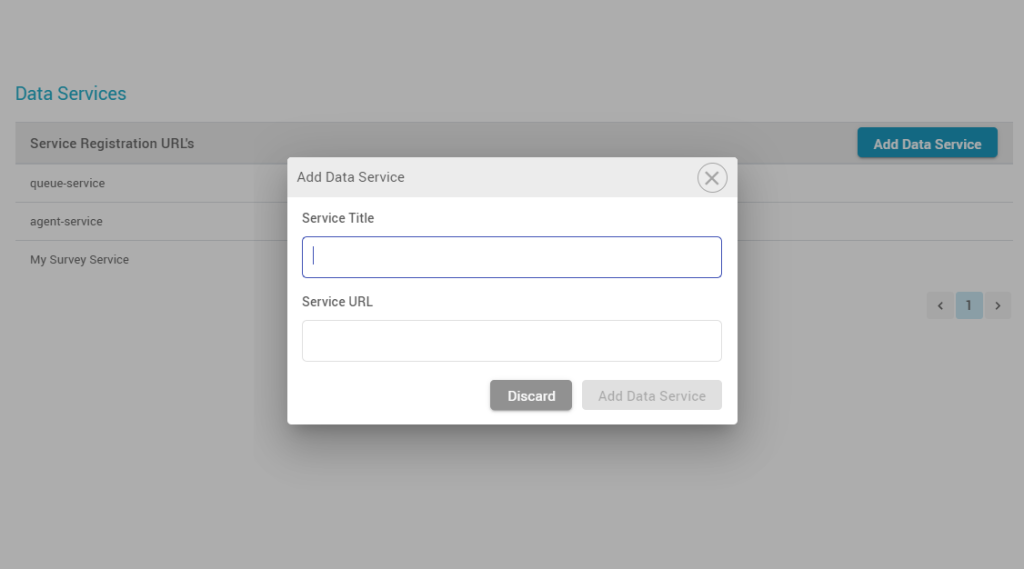
Design Dashboards with third-party data
Register third-party data services in the Dashboard application to report on statistics from an external system.
Use the same display types to create a custom dashboard for reporting on statistical data of your CRM or other systems.
*Part of an upcoming release
Alerts and Thresholds
For each gadget, set thresholds for your favourite KPIs such as calls abandoned, longest call in a queue, # of not-ready agents.
Get visual alerts (color change) on reaching thresholds.
Customize dashboards to show/hide selective fields
Add/remove parameters to customize your displays. Select filters to see the most appropriate data.